Difference between revisions of "Chris and art"
Griffintown (talk | contribs) m (Tweaking) |
|||
| Line 103: | Line 103: | ||
=== Rule 34 (tracing) gallery === | === Rule 34 (tracing) gallery === | ||
<gallery> | <center><gallery> | ||
Image:Chris-chan Traced.JPG | Image:Chris-chan Traced.JPG | ||
Image:Chris-chan Traced 2.JPG | Image:Chris-chan Traced 2.JPG | ||
| Line 109: | Line 109: | ||
Image:Chris-chan Traced 4.JPG | Image:Chris-chan Traced 4.JPG | ||
Image:Chris-chan Traced 5.JPG | Image:Chris-chan Traced 5.JPG | ||
</gallery> | </gallery></center> | ||
==Gallery== | ==Gallery== | ||
<gallery> | <center><gallery> | ||
Image:441-CubScoutShield.JPG | Image:441-CubScoutShield.JPG | ||
Image:442-HedgehogShark1.JPG | Image:442-HedgehogShark1.JPG | ||
| Line 170: | Line 170: | ||
Image:505-100 0539.JPG | Image:505-100 0539.JPG | ||
Image:506-100 0540.JPG | Image:506-100 0540.JPG | ||
</gallery> | </gallery></center> | ||
==TL;DR== | ==TL;DR== | ||
Revision as of 02:37, 27 January 2010
Art has been, and always will be, Chris's selling point. From the very day "Jason Kendrick Howell" found out about Chris and his creation of Sonichu to today, many people have been drawn (no pun intended) to Chris because of his infamous work. To this day, many people wish to see more of it and will go to extreme measures to get him to work more.
When faced with Chris, most people will undoubtedly ask, "is there any field of endeavor that he doesn't completely suck? Is there any field where he has shown any improvement at all?" One could argue that he has, in fact, got slightly better over the years. There's no question about it; the early Sonichu comics are noticeably worse than the newer ones. However, we must remember that he wasn't any good to begin with and has barely gotten any better in spite of years of practice. Chris's drawings still remain disproportionate, child-like, unimaginative and hilarious. GodJesus bless his little autistic heart.
The sad part is, this is the closest Chris has to an actual "skill". It's no wonder he's never been able to get and keep a job.
Chris and the medium
Exercise of skills and improvement in craft
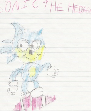
Since Chris first started drawing, his artwork has been abysmal. While it may have improved since the day he first drew Sonic the Hedgehog, there's still considerable room for improvement. Sad to say, Chris refuses to improve, thinking that what he's doing now is the shit.
As Chuck Jones said, everyone's got a hundred thousand bad drawings in them. Chris is just too lazy to get them out. Chris fails to understand that even great artists don't get every stroke down on the paper perfectly; he just scribbles down something and thinks that is the best thing he can ever do. Many beginning artists notice immediately that they can't draw worth a damn, and spend quite a lot of time erasing and redrawing. This is perfectly normal. Where Chris fails is not stopping and asking "does this look good?" If the answer is "no," the obvious solution is to keep trying. In Chris's mind, the answer is always "yes."
Chris does not appear to draw much outside of the comic pages themselves. He almost never shows any pencil sketches (and those only when trolls whip him into releasing them), and never any practice drawings, master copies, anatomy studies, speed sketches, class exercises, scribbles on napkins from restaurants, or anything of that sort; it is easy to question whether or not he does any of the latter sorts at all. When he tried to prove his real identity, he just showed drawings that everyone had seen before, some of which were several years old. Most amateur or professional artists, if put into that situation, would probably flip open their sketchbook and show new stuff they'd just drawn an hour ago. He appears to do at least some pencil sketches before drawing the comic (the hasty release of Sonichu 9 also proves that), but judging from his tutorial video, he doesn't ink the pencilings, he just re-draws everything hastily.
He revealed in a response to an email dated 21 November 2009 that he spends "an hour at most" drawing a comic page and about a half-hour coloring it, "sometimes longer depending on the thought process" (whatever that means). In other words, he invests only a fraction of the time most serious artists put into their work, and it shows. He even offers patently terrible advice to a fan in Mailbag 16, recommending they focus on drawing foreground characters before doing any kind of background. For most comic artists some minimal background is drawn first so the artist can have some sense of dimension and perspective, then foreground and background images are refined simultaneously. Of course, most comic artists don't work with ballpoint pens and crayola markers...
Ultimately, Chris will never improve because he doesn't actually care about his art or his comics. He's not interested in creating art for art's sake, and he doesn't care about the story. Like with his videogame ideas, he considers any idea he comes up with just as valid as anything he actually commits to paper. He only started publicizing his work as a horribly misguided attempt to attract women, and he only continues to work on it because he's convinced he has a large fanbase that's demanding it. And he only cares about that because he thinks that some of his fans are women who might reward him for his skills.
Comic writing and structure
- Main article: Chris and writing
Chris has major problems keeping the story together: the comic is not scripted at all, and he keeps adding details that he doesn't properly explain later in the story. As far as comic structure goes, he also has problems with textwalling and keeping the speech bubbles in comprehensible order.
Choices of materials and technology
Chris seems to be under the delusion that hand-drawn comics are always better than any drawings produced through other means. This can clearly be attributed to only the fact that Chris hates to change what he has already learned. Most artists would usually say that no material is inherently better than any other, all that matters is that in the end, you have aesthetically pleasing end results — or aesthetically unpleasing, if that was the intention.
While it's true that buying fancy pens won't make you a great artist, they certainly help. Chris doesn't believe in decent-quality media. Cheap paper, cheap pens, Crayola Fucking Magic Markers — serious artists would invest a little bit more of thought on these issues as well. Good art pencils do not cost that much more than crappy ones, and are available at wide range of blackness. The lowest-quality papers tend to crinkle (even before you stick it in a scanner) and turn yellow really fast, while even the typical photocopy/laser printer paper avoids that fate. Chris also pinches pennies in altogether wrong way by partaking in rampant textwalling to "save marker ink"[1]; while great modern artists have occasionally made poignant art by consciously not expending material, most artists probably prefer to use art supplies for their intended purpose. (Duh.)
As seen in CWC - Hand Drawn Original, his sketching set is something no adult would be caught using professionally, and he doesn't even use the most basic of drawing desks or surfaces. His creations come to life via a toy-like sketching kit from Spin Master called Reflecta Sketch (shockingly, not the Strawberry Shortcake kit seen in the link; it's assumed the product bombed and he was one of the few who bought it, thus the lack of a product page from Spin Master), which only allows him to trace on basic letter-sized copy paper, not the large sketching paper most professional artists use. The kit comes with a reflective piece of plastic where an original can be placed to the left and the reflection is used for tracing an outline, allowing Chris the ease of copying other artists' works to use in his general and Rule 34 artwork.
Of course, considering where Chris prioritizes what he gets from his monthly tugboat (i.e., sex toys, My Little Ponys and vidya games), it's no wonder that a man who buys all his clothing from a Salvation Army that's apparently run by clowns would invest in art supplies that were intended for a third-grader.
The less we say about Chris's use of computers in putting the final touches in his comics, the better - he uses Comic Sans, a font that's almost universally condemned among comic artists as overused and ugly.[2] [3] Chris appears to have some version of Photoshop at his disposal (as seen in the "Spiderman-fucking Clyde" saga), but as everyone can tell from the results, either he doesn't know how to use it, or he doesn't do very much with it.
Drawing techniques
Chris has never even learned to hold a pen correctly. Instead of holding the front of the pen with the thumb and forefinger, he draws with his index finger sticking out and bent around the pen.
Even worse, he doesn't have a working drawing process. Well prepared is half done, and most artists spend most of the time in the preparation phase: sketches, sketches, sketches. On the other hand, Chris seems to focus on what is admittedly the most taxing part of drawing: coloring and putting in the final little details. As said above, Chris hastily sketches something or draws outlines, then colors the drawing. The whole point of pencil sketches is that you know beforehand where the ink goes; the idea is to make sure your drawing looks right before you make hard-to-repair mistakes. The whole process of refining the work and whittling out imperfections one by one until you're satisfied with the result is probably something that would cause too much stress. Also, Chris is incapable of drawing simple straight lines or even coloring within his lines 100% of the time.
Visual style and anatomy
Before the comics, Chris at least attempted a style approaching realism for "paintings" (actually, on close examination, most are crayon drawings filled in to a ridiculously thorough degree). Most of the results are buried deep in the Scrapbook of Fail and are about as good as you'd imagine: the anatomy is questionable at best, and rarely consistent. Notably, his glasses are drawn as gi-normous goggles, and appear to be the same frames he wears today. Around the time he got into Pokémon, he started moving from pseudo-realistic into a style the Internet would be much more familiar with.
Chris started out with a cartoony style for the comic book, in that all the characters had round heads and comparatively small eyes. One trait that has persisted over years is the way he draws smiles (and oh boy, do his characters smile a lot): A smiling mouth that consists of a curved line with two tiny curved lines on the ends. Most children draw smiles this way, but there always will be a day when the kindergarten or 1st-grade school teacher says that this is just not how people draw smiles in the real world. Nowadays, though, Chris is more eager to draw only half of the smiles, which looks a little bit less creepily manchild-like.
Things changed as Chris got into anime, as well as manga, and sought to emulate them to impress his then-current gal-pal, Megan Schroeder. As like many amateur western artists who ape the style without attempting to adapt it, he simply uses the clichés of "anime style": big eyes, speed lines, panty shots and many of the cheesier conventions, along with heads shaped like pentagons. There is no attempt to incorporate, fuse or otherwise adopt manga elements in a creative and original manner; these art elements are simply layered on top of his original "style" with no adjustment. Chris is no Go Nagai, nor has he probably even heard of him.
However, Chris owns at least one book about drawing manga, as seen in My Half of A Whole New World for Kacey. The book in itself covers everything to do with portraying couples. This volume had images of couples in bed making love. Naturally the degree of the scenes isn't that extreme, but the fact that it's in there lends to the explanation as to why Chris might have purchased the book. Whether or not Chris bought it simply to better draw out his delusional fantasies or simply for more material to gawk at during Mass debating isn't known. Either way, the book has taught him nothing since his works are still horrendous mockeries of what cartooning stands for, Western and Eastern styles alike.
Tying in with this, Chris shows no interest in proportion or even basic anatomy. The manga style allows for some artistic license when drawing human beings, but after seeing what Chris does with anatomy, or rather doesn't, it's clear to see his license needs to be revoked. He draws characters as colored-in outlines, and as a result they have no appreciable anatomy or proportion. All his characters are made of lumpy, sexless shapes with crude genitalia attached. For someone who's supposedly a porno connoisseur, Chris doesn't seem to notice there are sexual characteristics that make women attractive beyond boobs, china, and ass; if he does, he's doing a predictably terrible job depicting them. Note the porn Chris rips off, and how he mimics the basic shape of each picture while getting the anatomy (wonky as most of them are) disturbingly out of whack.
When Sonichu is drawn by Chris speeding towards a rescue, he doesn't look like he's rushing to save the day Sonic-style, but instead has the proportions of those over-exaggerated steamroller men that are the hallmark of circa 1960's Yellow Page ads for construction companies. It's easy to see that Chris is copying the original style of Sonic's running based off the old DiC-produced cartoons and the early comics (which Sonic was depicted running in a cartoon-like, spinning-wheel manner), his lack of proportion and lazy manner in which he refuses to show bending legs give the illusion of Sonichu becoming a steamroller.
What's worse is that even though his characters are simple shapes, they aren't even consistent simple shapes. From one drawing to the next, Chris draws his characters (even himself) differently. Limbs change shape, heads change size, and faces become unrecognizable; it's only by color scheme that we can guess which character is which. If he were even to practice in the slightest degree, anatomy and character design would be more consistent. Beyond his differently-colored eyes and Sonichu medallion, no two Chrises have ever looked alike, or even remotely like the actual Chris, although Sammy comes somewhat closer.
An interesting thing to note is that, if a character is part of the background (and sometimes, even if they aren't), Chris will draw that character either one of two ways: as a simple white silhouette or as a stick figure. The silhouette drawing was a nuance that Chris picked up after watching the anime series Excel Saga, while the stick figure idea was picked up through South Park. Interestingly, Rob Liefeld has also used this shorthand, and, as his many "admirers" will point out, it's one of the laziest shortcuts ever, not to mention blatantly obvious in a medium that isn't animated.
Chris's use of color is rather staggering, and it's hard to begin describing it. Because he colors everything with markers, he uses a lot of flat, basic colors, often as bright as possible. He often doesn't even try finding natural shades of things, or sometimes even shades that would fit in the drawings at all. Such coloration only makes his drawings appear even more childish.
Character Design
As stated throughout this article, despite Chris's colorful cast of characters, many of them rip off designs from existing characters, with Chris making no effort whatsoever to disguise them. His Sonichus tend to follow the same Sonic-type anthropomorphic look of slick backed quills, shoes and gloves. Rosechus, however, vary. Rosechu herself follows Amy Rose's look; Bubbles, Simonla and Angelica follow the SatAM Sonic series and Archie comic series' lack of clothing á la Sally Acorn; and Zapina is the only one with an original look.
This design failure goes beyond his Electric Hedgehog Pokémon and extends to his humans as well, especially those connected to him. Most of the time, he'll either disguise their faces with a hood or lift designs from characters from other series. Bagget and ScotPalazzo were pulled from characters from Excel Saga. Whenever Chris needed designs for his e-sweethearts' families, he really went off the deep end: Officer Keino, Ivy's father, had his design cribbed off Coach McGuick of Home Movies and the father and sister of Kacey were ripped off from Guile from Street Fighter and Candice from Pokémon.
Beyond that, he doesn't even bother trying to design better clothing for his characters. Most of them wear stereotypical "basic" clothing and Chris himself wears his usual clown shirts and pants. With the sole exception of Meg-chan, every female that shows up in his comics wears high-heeled dress shoes, probably inspired by the fact that most elder animated female characters tend to wear those types of shoes wherever they go.
Chris and the industry
In the Sonichu Chronicles and Chris's resume, it's revealed that Chris is under the impression that his art isn't just good, but professional quality, and that he aspires to get into the comics and video game business. The résumé reveals his desire to work as an artist for a professional comic company such as Archie Comics or Marvel, creating his Sonichu comics. There is no word on whether or not he actually submitted anything to these companies, or if they replied.
It has been demonstrated again and again that Chris has little concept of how the creative industries work, which is quite strange; one would assume that a person seeking a career in the industries would at least take some effort to find out how the said industries work. The publishing industry does not want or seek résumés; they make publishing contracts on completed manuscripts and works that have been submitted to them. Comic publishers don't employ artists unless they have a portfolio of work, and top-notch publishers probably want actual previous publication credits before they let the artists mess with their priceless properties on their dime. Chris hasn't even tried any self-publishing channels, and the thought of monetizing his web comic hasn't crossed his mind either. It also took a while for Chris to come up with the idea of drawing on-camera.
Chris's understanding of copyright is a chapter in itself. Publishers want primarily original works, because securing the necessary rights to publish derivative works is often difficult or impossible. Chris has even resisted attempts to educate him in this regard.
In the Sonichu Chronicles he gives Shigeru Miyamoto "permission" to use the cover to his hand-drawn Nintendo Power magazine as the inevitable cover for when his game is created, even though it's several years old (and, in fact, even worse than Chris' current skill at art).
Originality
He has none. Let's leave it at that.
Plagiarism and stealing
- See also: Chris and copyright, Chris and tracing
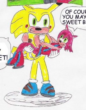
From the day Chris drew his Homemade Nintendo Power magazine, it's easy to see that Chris copies what he sees. This easily started with his drawings of Sonic, Mega Man X and the like on there, but it really spiraled out of control with the creation of Sonichu and Rosechu. It's easy to see that, whenever Chris needs an awesome pose or something for a character, he'll usually fall back on what he's seen. This usually means that he'll take a piece of artwork and change it to his own needs. For example, Rosechu's nudes in Episode 17 are actually tracings of Sonic, Transformers and Family Guy porn, as seen below.
Even more so, Chris isn't above stealing and even altering others' work just to make it his own. Sonichu's easily a given, but it's really evident when he steals from his TRUE and HONEST fans and sweethearts. Megagi, Jiggliami and Layla were taken from, respectively, Megan, Blanca and Ivy after they abandoned him. The character of Simonla Rosechu was created when Chris took a character Evan created, Simonchu, and slapped breasts and a china on it. Chris frequently didn't credit original artists when posting fan art to deviantART, and the current CWCipedia fan art page has no credits whatsoever, apart of a brief mention of PandaHalo. Yet, in the not-so-unlikely opposite case, if one were to steal Sonichu, there'd be hell to pay.
Rule 34
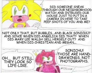
As Chris has no shame, neither do his pictures. Many of his drawings have been outright explicit and caused quite a stir with people. Of these pictures, the most damning one of all is the infamous ShecameforCWC.jpg, which brought an end to the Megan Saga and cemented the notion that Chris was an incestuous pedofork. It's these artworks that provoked him to up the age on all of his Sonichus and Rosechus so they can be true, loving couples without any of that messy pedofork undertones.
Still doesn't work, as one of his recent pieces of art ended up getting him tossed out of DeviantArt. Again.
The pictures below are a group of Rule 34s Chris drew for Sonichu 8. As seen in this gallery, Chris can't even copy bad porn to save his life, with Rosechu turning into a deformed monstrosity in each panel, all for the sake of sex. Especially noticeable is the final picture, which shows off a recurring trend in his pictures: the "Glowing Ethereal Cunt of All Ages", in which Chris draws the "cum" from the woman around and outside the vagina instead of from the inside, leading it to have a "glowing" effect.
While all the following images are obviously (bad) Reflecta Sketch tracings of Rule 34 pictures that Chris himself loaded on to his Encycapeeya Dramakka Paysh, it's not clear whether or not all his other porn drawings are also tracings. It's likely that they are, and the source material Chris stole those from is just not as blatantly obvious.
Rule 34 (tracing) gallery
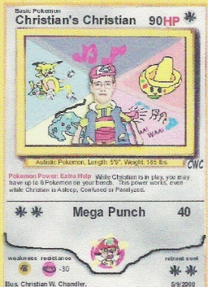
Gallery
TL;DR
Chris is an anti-artist.
Sauces
| Chris and... |
|
Body: Drugs • Fashion • Gender • Health • Nutrition • Sex Psyche: Coping • Manipulation • Mental healthcare • Nostalgia • Reality Personality: Anger • Ego • Hypocrisy • Kindness • Negligence • Personality • Remorse • Stress Expression: Art • Censorship • English • Language • Music • Oratory • Spanish • Writing Society: Contests • Death • The Law • Politics • Pornography • Race • Reading • Religion • Sexuality • Socialization • Sports Business: Brand loyalty • Business • Copyright • Money • Negotiation • Work Technology: Cameras • Electronics • The Internet • Science • Television • Video Games |
