User talk:NeoShadow/Infobox 2.0 Experiment
- Wow, that is VERY nice. Just curious, is it different to use than the current Infobox? Personally, I'd go ahead and change the current infobox, yours is a lot better, but I'd try to solicit feedback from other users first. --Champthom 10:49, 14 April 2011 (PDT)
- Yeah, man, it works just like the old infobox. Same usage. Simple and easy. Like, if you put this in the page of the current infobox, all the infoboxes would update with no problems.
Except for one thing. If the text in any of the info fields under the video is too long, it doesnt automatically jump to the next line, it stretches the infobox beyond the width of the video, so on some occasions it may be neccesary to manually skip some of the text to the next line (as you see done on this experiment page), but other than that, its all good.LOOKS LIKE THAT PROBLEM FIXED ITSELF NOW. --NeoShadow 13:03, 14 April 2011 (PDT)
Infobox Implemented
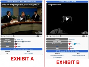
I have now implemented the infobox into the cwcki itself. I've looked over a couple video pages now, and looks like it works just fine. The only, sort of kinda problem is that, since the info section was designed like a simple table, the thing likes to be inconsistent with the width of the info sections, based on the width (or some other variable?) of the content in the info section. The result of this, is that some some of the infoboxes look fine (exhibit A), but in others, the grey info area stretches across half of the goddamn infobox (exhibit B). Its kind of an annoyance, but I don't think it looks too horrible, until a more permanent solution can be found (if required). So, now we see the general reaction. If people hate it, its pretty simple to revert the infobox to its original state. If people like it, I'll add 2.0 versions for all the other infoboxes, leave you with that to enjoy and then crawl back to the same dark corner from which I reappeared to bring you this gift. Glad I could help. --NeoShadow 04:12, 15 April 2011 (PDT)
- After hitting "Random page" a few times and looking at whether or not the "stretching" problem comes up, it seems that it only occurs when there's a "Performance Style" section. I won't pretend I'm good at editing templates, but I'm sure that's where the problem lies. I don't think it's really that big an issue, though. Freecell (t/c) 04:25, 15 April 2011 (PDT)
- Scratch that, the one on this very page doesn't have that problem and yet has a Style section, and when I just tested it on my userpage without the Style section, it still stretched. Perhaps it's a problem with how videos are centered on the specific pages? Freecell (t/c) 04:33, 15 April 2011 (PDT)
- I think the reason why the Performance Style section doesnt make the video here stretch out, is because there is more content on the other side, which balances it out and pushes the grey section to be smaller. Like I said, the infobox was designed to be like a simple table, like on any microsoft office program or whatever. If one side has more content than the other, then it will stretch out to have more room. At elast, thats what I think the problem is.--NeoShadow 04:45, 15 April 2011 (PDT)
- Fuck it, I got bored so I did all the infoboxes anyway. --NeoShadow 14:55, 15 April 2011 (PDT)
