Difference between revisions of "Comic Sans"
(Created page with "{{stub}} thumb|You'll see a hell of a lot of it if you read this comic. '''Comic Sans''' (or '''Comic Sans MS''', "Sans" short for "Sans Serif") is...") |
(Tried to remove the excess Chris bashing. The anti Comic Sans angle seems overdone too.) |
||
| Line 2: | Line 2: | ||
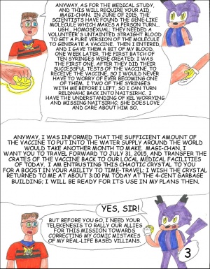
[[File:SchuComic10P3.jpg|thumb|You'll see a hell of a lot of it if you read this comic.]] | [[File:SchuComic10P3.jpg|thumb|You'll see a hell of a lot of it if you read this comic.]] | ||
'''Comic Sans''' (or '''Comic Sans MS''', "Sans" short for "Sans Serif") is a horribly overused font typeface that draws the ire of almost everyone who looks upon it. It was released in 1994 for use in MS Paint by Vincent Connare, but apparently [[Bill Gates]] didn't get the memo and put it in every | '''Comic Sans''' (or '''Comic Sans MS''', "Sans" short for "Sans Serif") is a horribly overused font typeface that draws the ire of almost everyone who looks upon it. It was released in 1994 for use in MS Paint by Vincent Connare, but apparently [[Bill Gates]] didn't get the memo and put it in every program released by Microsoft that uses any kind of text manipulation. Ironically, the version of Comic Sans used in Microsoft products has serifs on several letters. The largest groups of people who use it are middle aged office workers who think it makes the company potluck emails look more "fun" and children who don't know any better. | ||
[[Chris]] uses Comic Sans as his de facto font of choice in almost everything he does. | [[Chris]] uses Comic Sans as his de facto font of choice in almost everything he does. Possibly, he thinks by using a font with "comic" in its name will make his work seem more professional. Or, perhaps, its prevalence in the design of horrible free website in the 90's sticks in his head due to an unchanging world view. In truth, the only time Comic Sans is ever appropriate to use is for children's [[Alex's Lemonade Stand|lemonade stands]] and [[Chris_and_art#Choices_of_materials_and_technology|coloring books]]. | ||
==See Also== | ==See Also== | ||
Revision as of 17:39, 15 August 2012
Comic Sans (or Comic Sans MS, "Sans" short for "Sans Serif") is a horribly overused font typeface that draws the ire of almost everyone who looks upon it. It was released in 1994 for use in MS Paint by Vincent Connare, but apparently Bill Gates didn't get the memo and put it in every program released by Microsoft that uses any kind of text manipulation. Ironically, the version of Comic Sans used in Microsoft products has serifs on several letters. The largest groups of people who use it are middle aged office workers who think it makes the company potluck emails look more "fun" and children who don't know any better.
Chris uses Comic Sans as his de facto font of choice in almost everything he does. Possibly, he thinks by using a font with "comic" in its name will make his work seem more professional. Or, perhaps, its prevalence in the design of horrible free website in the 90's sticks in his head due to an unchanging world view. In truth, the only time Comic Sans is ever appropriate to use is for children's lemonade stands and coloring books.
See Also
- Chris and writing
- Chris and art
- Damn near everything with text he's made.
