User:SeventhBase/Art style
< User:SeventhBase
Jump to navigation
Jump to search
Revision as of 03:05, 12 August 2010 by SeventhBase (talk | contribs) (Created page with "== Evolution of Chris's Art Styles and Designs == The total sum of Chris's artworks come primarily in three iterations, outlined here: *''Generation 0'', which is Chris's first...")
Evolution of Chris's Art Styles and Designs
The total sum of Chris's artworks come primarily in three iterations, outlined here:
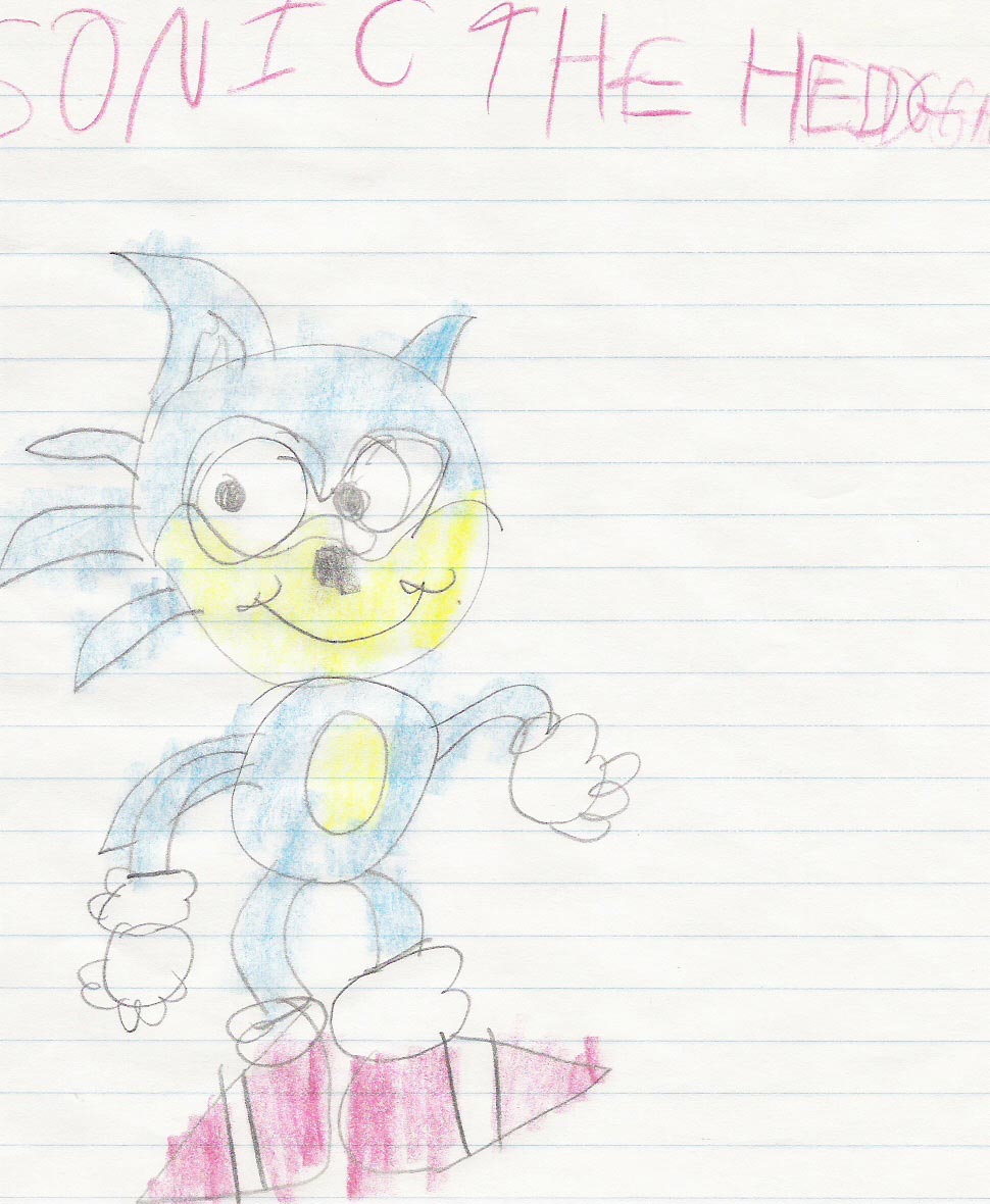
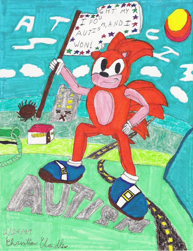
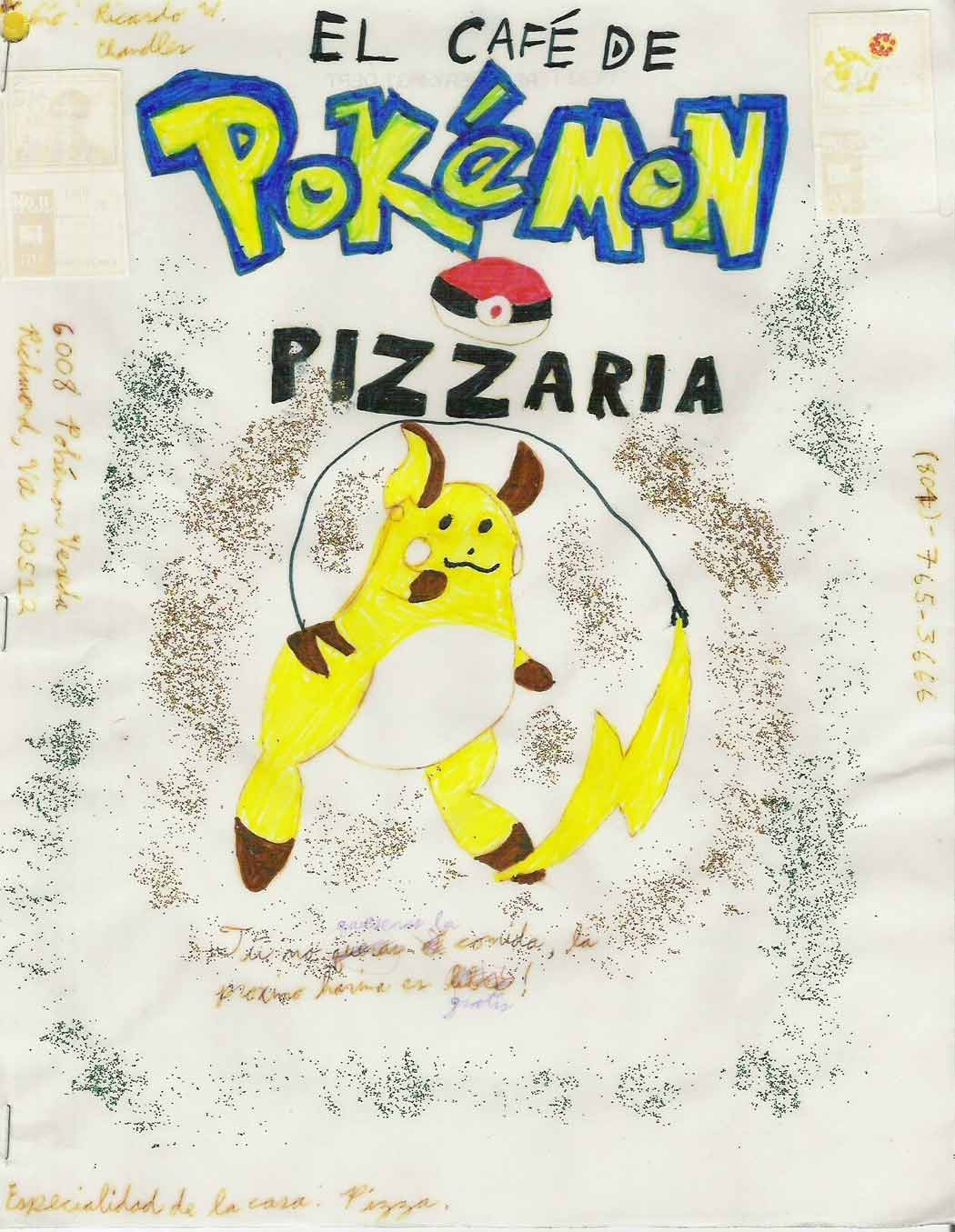
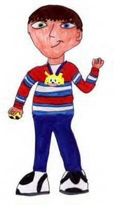
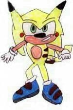
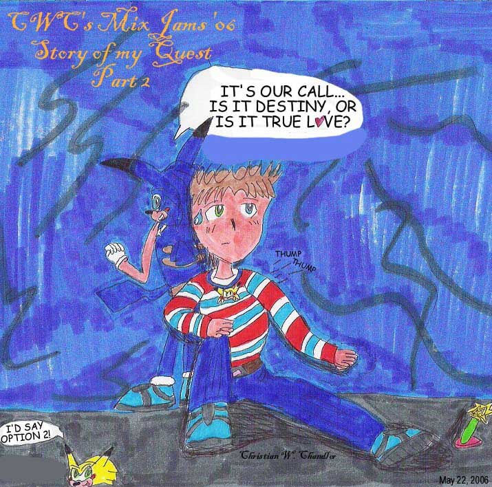
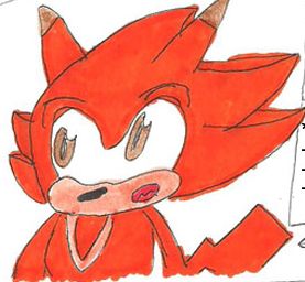
- Generation 0, which is Chris's first foray into Sonic, Pokemon, and recolors. Rather simplistic, it relies heavily on circles.
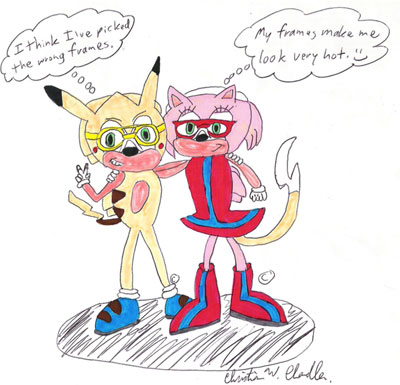
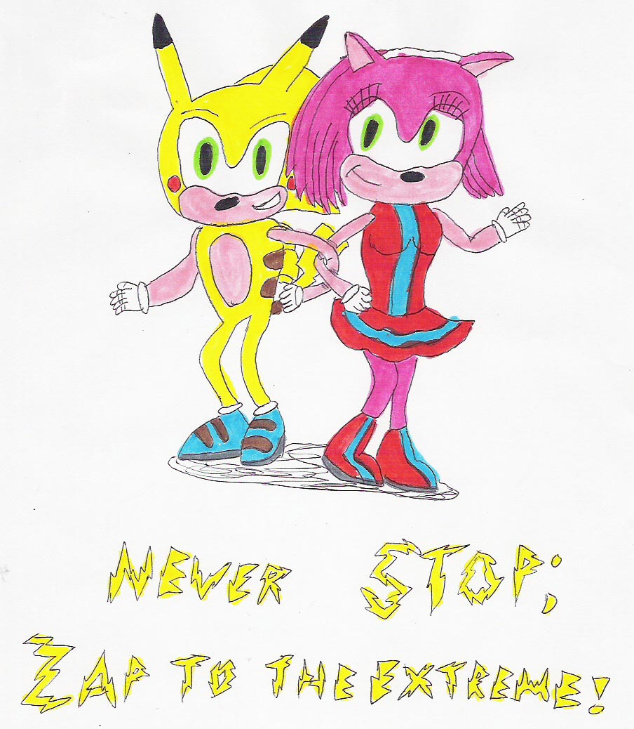
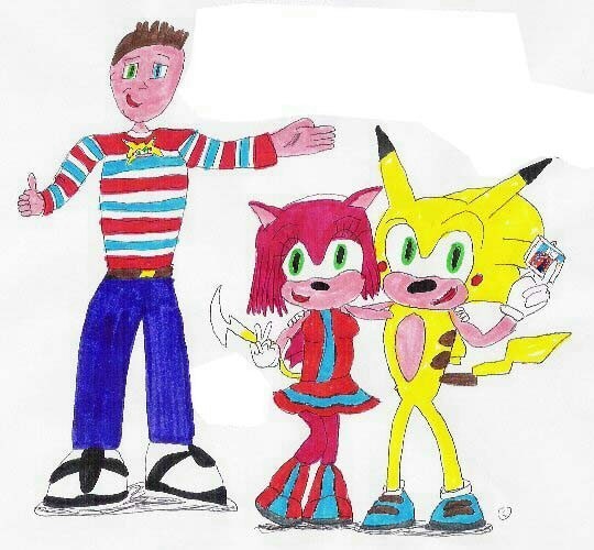
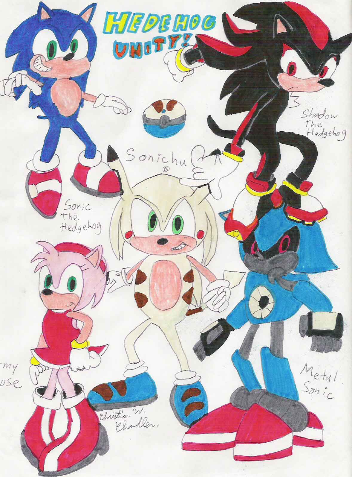
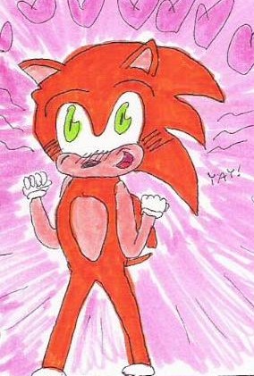
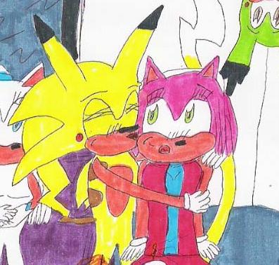
- Generation 1, seen in Chris's early works about Sonichu. Marked by plenty of soft borders.
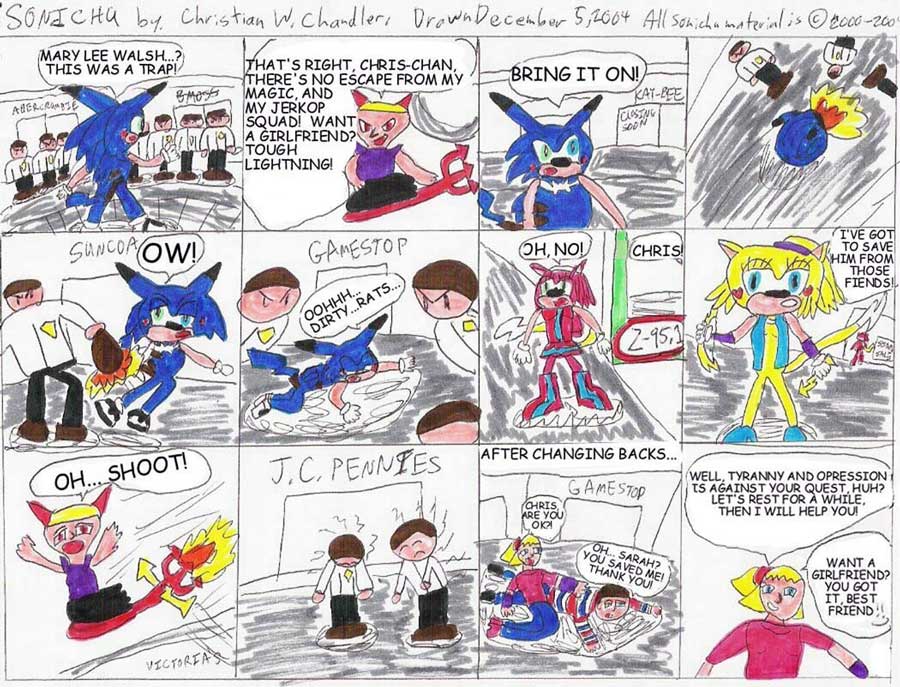
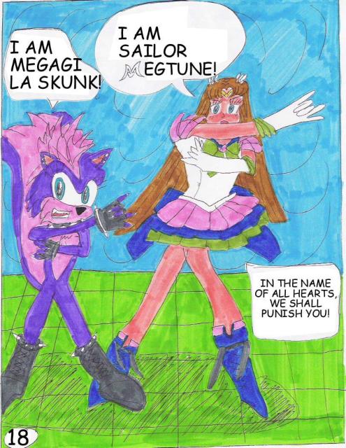
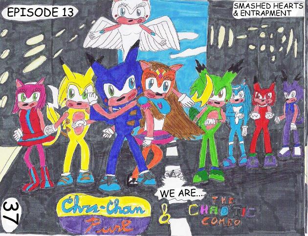
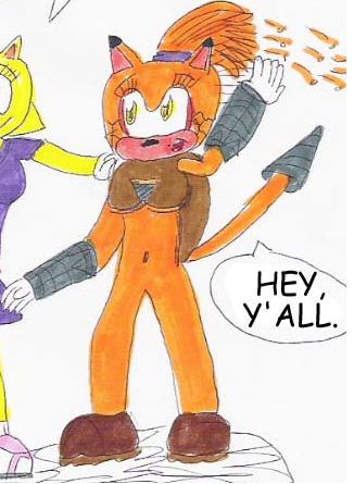
- Generation 2, which debuted in Issue 5 with the arrival of Megan. Has obvious manga/anime influences. Believe it or not, Chris demonstrates better mastery of the pen. Dispenses with soft-bordering entirely, lending more clarity to his images.
More to come.
Generation 0
Generation 1
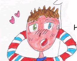
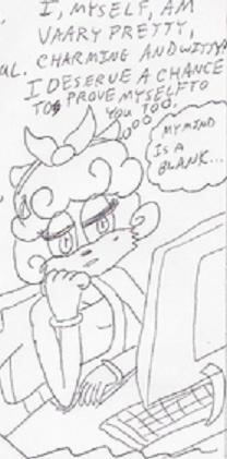
We start to see irises, but lazy eyes are still a major problem in larger pictures. Irises may or may not be bordered; generally, with smaller pictures, they are not.
The reason that rosechus all have that vacant stare is because Chris always draws the top eyelids (with accompanying eyelashes, natch), whereas they are usually omitted with sonichus.
Generation 2
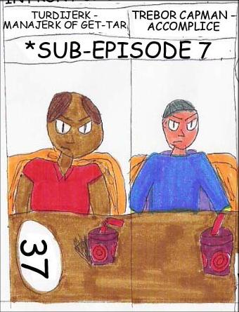
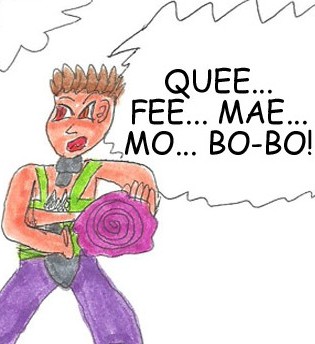
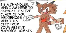
Note the difference between the two Bionic pictures. Chris's hair becomes defined. Antagonists remain in "Generation 1" style, indicating that Chris only puts effort into characters he likes.
