Difference between revisions of "User:Dethchemist77/Sandbox"
| Line 349: | Line 349: | ||
The box template currently has border thickness and margins set automatically, but it wouldn't take much to open those options up to the user | The box template currently has border thickness and margins set automatically, but it wouldn't take much to open those options up to the user. | ||
What I'm starting to think here is that {{Tl|Box}} should be modified to include options I'd want to use for the article message boxes. Then, I could take {{Tl|Mbox}}, and basically turn it into a customization of {{Tl|Box}}. Mbox could then be used for all message boxes, regardless of whether they're talk, article, template, or whatever. The lone exception would be the Userboxes, since, they're already well-established as a separate category, and there's no need to go messing with them. | |||
Below are the options I want the box to have. New ones I'd have to add are in bold. | |||
*title - The box title. Default: "I am a box" | |||
*text - The box text. Default: "I contain lots of interesting things " | |||
*image - The image on the left of the box. Default: "delayclose.jpg" | |||
*img_border - CSS for the border around the image. Default: "1px solid rgb(127,127,127)" | |||
*img_width - The images desired width. Default: "100" | |||
*border - Colour for the box border. Default: "rgb(125, 106, 141)" | |||
{{ | *head_bg - Colour of the box head. Default: Same as border | ||
*bg - Background colour of the box. Default: "rgb(224, 190, 253)" | |||
*width - Width of the box. Default: "450" | |||
*color - Text color for the box text. Default: "rgb(0, 0, 0)" | |||
*'''image_right - The image on the left of the box. Default: no image''' | |||
*'''img_right_border - CSS for the border around the image. Default: no border''' | |||
*'''img_right_width - The images desired width. Default: "100" ''' | |||
*'''some way to make the width toggle between px and percent''' | |||
At this point, I probably need to step out of the sandbox and experiment with an actual template. {{Tl|Ambox}} should be safe to play with, so I think I'll scrap its existing code and swap it out for the modifications I have in mind for {{Tl|Box}}. | |||
Once that's done, I'll attempt to replicate the templates above using Ambox. If I can do that, I'll copy Ambox into Box and try it again. Then, I'll alter Mbox to incorporate the fixed dimension settings I want all the message boxes to have. | |||
==Sidequest: Rainbow Box== | |||
Here's a retarded question I refuse to leave alone: Can I make a rainbow-bordered box like I did using html? | Here's a retarded question I refuse to leave alone: Can I make a rainbow-bordered box like I did using html? | ||
| Line 373: | Line 382: | ||
{| cellpadding="0" width=100% cellspacing="0" style="border: 2px solid #ffA500" | {| cellpadding="0" width=100% cellspacing="0" style="border: 2px solid #ffA500" | ||
| | | | ||
{| cellpadding="0" width=100% cellspacing="0" style="border: 2px solid #ffff00" | {| cellpadding="0" width=100% cellspacing="0" style="border: 2px solid #ffff00" | ||
| | | | ||
{| cellpadding="0" width=100% cellspacing="0" style="border: 2px solid #00ff00" | {| cellpadding="0" width=100% cellspacing="0" style="border: 2px solid #00ff00" | ||
| Line 381: | Line 390: | ||
{| cellpadding="0" width=100% cellspacing="0" style="border: 2px solid #6F00FF" | {| cellpadding="0" width=100% cellspacing="0" style="border: 2px solid #6F00FF" | ||
| | | | ||
{| cellpadding="0" width=100% cellspacing="0" style="border: 2px solid #8F00FF | {| cellpadding="0" width=100% cellspacing="0" style="border: 2px solid #8F00FF; margin: 0px auto; padding: 0pt; text-align: center; width: 100%; background-color: {{{bg|#ffffff}}}; color: {{{color|#00ffFF)}}}" | ||
| <div style="border-bottom: 1px solid {{{border|rgb(000000)}}}; background-color: {{{head_bg|{{{border|# | | <div style="border-bottom: 1px solid {{{border|rgb(000000)}}}; background-color: {{{head_bg|{{{border|#8F00FF}}}}}}; font-size: 1px; height: 8px;"></div> | ||
<div class="box_image" style="margin: 5px 8px 8px; float: left; border:{{{img_border|4px solid rgb(0, 0, 0)}}};"> | <div class="box_image" style="margin: 5px 8px 8px; float: left; border:{{{img_border|4px solid rgb(0, 0, 0)}}};"> | ||
[[Image:{{{image|078-StarFront.jpg}}}|{{{img_width|100}}}px]] | [[Image:{{{image|078-StarFront.jpg}}}|{{{img_width|100}}}px]] | ||
| Line 389: | Line 398: | ||
[[Image:{{{image|CWCFinger.jpg}}}|{{{img_width|100}}}px]] | [[Image:{{{image|CWCFinger.jpg}}}|{{{img_width|100}}}px]] | ||
</div> | </div> | ||
<div style="border-bottom: 1px solid # | <div style="border-bottom: 1px solid #8F00FF; padding: 5px; font-family: Verdana; font-style: normal; font-variant: normal; font-size: 13pt; line-height: normal; font-size-adjust: none; font-stretch: normal; font-weight: bold; text-align: center; color: {{{color|rgb(0, 0, 0)}}}">{{{title|Featured Article}}} | ||
</div>{{{text|'''This article is filled with {{{2|TRUTH and HONESTY}}} and was once 'Article of the Now'.'''}}} | </div>{{{text|'''This article is filled with {{{2|TRUTH and HONESTY}}} and was once 'Article of the Now'.'''}}} | ||
|} | |} | ||
| Line 398: | Line 407: | ||
|} | |} | ||
|}</div></center> | |}</div></center> | ||
Basically, this involves nesting the box inside of six other tables, each with a different border color. It looks pretty (moar liek pretty ''gay'', amirite?), but it may be more trouble than it's worth. | |||
It could be of some use, if anyone feels like making boxes with multi-colored schemes like this. I could see a "shirtbow" pattern or a "battery blue/pikachu yellow" scheme coming into play. | |||
Just in case anyone is following this, I don't plan on using these rainbow borders and bizarre color schemes once I actually get down to business. I just find it easier to test the code this way, and I want to make the message box design as flexible as possible. | Just in case anyone is following this, I don't plan on using these rainbow borders and bizarre color schemes once I actually get down to business. I just find it easier to test the code this way, and I want to make the message box design as flexible as possible. | ||
Latest revision as of 17:41, 30 January 2011
Message Box Template Review
What I'm trying to do here is go over the various message box templates and optimize them for quality. My concerns with the message box templates are as follows:
First, they're not really uniform in appearance. I think the Userboxes are a good model of what I want to accomplish here. The Userboxes aren't identical or anything, but they're all the same width, about the same height, use about the same image size, and most of them feature some sort of clever text and/or image related to CWC. By contrast, the article message boxes all vary in size, color, formatting, etc. Some of them use CWC-related images to humorous effect, some don't. Some don't use images at all. They serve their purposes, but I think many of them could use a makeover.
Second, I'd like to harmonize these things to use a single message box template. As it is, most of them were created independently of one another, which means that anyone trying to create a new message box is probably going to start from scratch. The whole point of templates is to save users the hassle of reinventing the wheel, so hopefully my work here will make the CWCki a little more efficient.
I've copied the templates' coding into this sandbox, so I can play with them without editing the real templates or disrupting the CWCki.
A-D
{{Apocrypha}} (Usage)
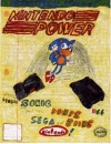
Notes Changed image to picture of Chris's Homemade Nintendo Power, since it's an apocryphal issue of the magazine. Not totally satisfied with that, but it's better than the Dead Sea Scrolls, I think.
{{Articleofthenow}} (Usage)
Notes: I don't think this template is being used, which is a real shame, because it looks pretty swank and we could use a handy reference to the best articles.
I've added the rainbow Christmas star in place of the template's original gold star, and it looks awesome. Just to play around, I've also added a rainbow border to go with the star. Maybe it's too much, I don't know. The existing template has no width parameter, so for the time being, I'm giving it a width of 70%. I'll try that number for the other boxes and see how well that works.
{{CWCipedia}} (Usage)
Note: I'm not planning to mess with this one much, since these side boxes are sort of a category unto themselves.
{{Delete}} (Usage)
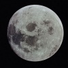
Note: Basically copied the Article of the Now table to this one, since it accommodates the image better. When the time comes, I'll need to set it up so it toggles between the real Moon and the comic Moon when you go from deletion to speedy deletion.
{{Deletedaudio}} (Usage)
Notes: Looking good with the AoTN table formatting. I like the format of the header message, but I wonder if it might be changed to something funnier.
{{Deletedvideo}} (Usage)
Notes:Tweaked this to resemble the Deleteaudio template more.
E-I
{{Essay}} (Usage)
Note: Muuuch better. Nothing says "minority viewpoint" like Chris reading from a paper in his suit coat. Upon further review, this template is probably more of a talk page message box than an article message box, given its usage. Will need to recategorize.
{{Fan art}} (Usage)
Note: I don't object to the use of pickles here, although I think some actual fan art would be more appropriate. Maybe Sonichu's face cropped out of a larger composition. The point is that we have a large assortment of fan art, so why are we using a stock image of pickles?
{{Honest}} (Usage)
{{Illustrations}} (Usage)
Note: Dicked up the color scheme by mistake, but I was probably going to change it anyway.
{{Improve}} (Usage)

|
NEEDS IMPROVEMENT OK, so this article needs {{{1}}}. But at least it's face isn't FUCKING ORANGE. Get this page what it deserves and {{{2}}}. |
Note: The Improve Template isn't really used anywhere, except to make the ImproveMusic template below, which is only on one article. I think we could still use it, but it needs an overhaul. The Soviet theme isn't doing it for me.
{{ImproveMusic}} (Usage)

|
NEEDS IMPROVEMENT OK, so this article needs fully transcribed lyrics. But at least it's face isn't FUCKING ORANGE. Get this page what it deserves and add some transcribed lyrics... |
Note: This is what ImproveMusic would look like if I edited Improve to look like the box above. Realistically, though, I can't see much justification for keeping the template around.
{{Incomplete}} (Usage)
Note: I think it's pretty easy to confuse this template for the Unifinished one, which is for works that Chris hasn't finished. Since this one is for stuff Cwcki users haven't finished, I propose changing the image and text to this 4-cent Garbage theme.
M-R
{{Merge}} (Usage)
|
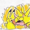
It has been suggested that this article should be exposed to seven Chaos Emeralds and merged with [[{{{1}}}]]. Discuss on the talk page. |
Note: This is a perfect example of what I want all the message boxes to look like, in terms of image and text.
{{Needs Images}} (Usage)

|
This article is BORING and needs more images. Make it better by inserting some of Chris's shitty drawings. |
{{Needs Updating}} (Usage)

|
Chris's recent failings have helped CWCki gather more information for this article. Be a winner by adding this information in. |
{{Orphaned}} (Usage)
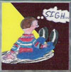
Note: Swapped in a crappy drawing of Chris sulking, and this template is suddenly 1,000,000% better.
{{Oversized}} (Usage)

|
OVERSIZED This article or section may be a bit excessive in one place or another. Help CWCki by editing out some of the fail. |

|
Note: How do we have a template called "oversized" that doesn't use the iconic Drinking Straw image? Hell, it even links to the article, so why use Barb?
Q-Z
{{Quality}} (Usage)

|
This article is much like a pair of DIRTY, CRAPPED BRIEFS. |
| It does not meet quality standards and is an abhorrence and blasphemy of CWCki's good name.
You can help by consulting the talk page and improving it also, read this. |
{{Recent}} (Usage)
This article relates to a recent Chris-related event. As a result, there may be many CWCki users trying to contribute and the content of the article may change rapidly.
Note: Boring and unused. Also, probably redundant, given the Ongoing template.
{{Rename}} (Usage)
| This article, like Mary Lee Walsh and Megan, may need to be renamed. | |
| Get ready to retcon and join us on the talk page to discuss this further! |
{{Split Off}} (Usage)

|
This article is too large or off-topic. It has been suggested that we smash its Heart level down to 15% and split off the pieces into their own article. Discuss on the talk page. |
{{Stub}} (Usage)
{{Tardrage}} (Usage)
Note: I like this template because it has a lot of customization features built into it. I think some of the others here may be the same way, but if I end up with some sort of single meta-template for message boxes, it should definitely include the options in Tardrage.
{{Taxpayermoney}} (Usage)

|
YOUR TAX DOLLARS AT WORK! The contents of this page have been bought with tax payer money! |
File:SocialSecurityLogo.jpg |
Note: Another good one. I like the use of two images, the color scheme, and the text. You can tell a lot of thought went into this one. Otherwise, it'd be some purple-on-lime-green box with "This content, like Sonichu's wife will soon do when she's a whore, will proceed to be paid for using taxpayer money."
{{Transcription}} (Usage)
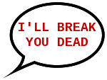
|
This media needs a complete transcription. Help CWCki by transcribing the audio. |
Message Boxes that Use Metatemplates
{{Ongoing}} (Usage)

|
Ongoing
The things described in this article are still happening, so it may be subject to frequent change.
|
{{Protip}} (Usage)
PROTIP: Men are the magnets. Women are the metal.
|
{{Unfinished}} (Usage)

|
Unfinished
Chris has yet to complete this project due to stress.
|
Templates That Probably Aren't Worth Working On
{{Featured article}} (Usage)
Note:This one puts a star at the top of the article, and categorizes it under Featured Articles. Apparently unused, and perhaps redundant given the "Article of the Now" template.
{{Notice}} (Usage)
Note: Apparently unused. Not surprising, given how many specialized message boxes we already have. I really think that giant finger image needs to end up in some message box, even if this one ends up getting deleted.
Project: Dethbox
Now that I've got decent-looking drafts for the message boxes, I'm gonna try to cook up a template they can all use. I'll start with {{Box}} (Usage).
Article Message Box
This is a draft of the new Article Message Box Template. I made the colors all nutty so I could tell what I'm doing.
|
From playing with this thing, the immediate limitation is that the image border is more customizable than the box border. I can change the color of either, but I can't change the black border's thickness or style. I also can't enter a percentage value for the width. That's not a major issue, I suppose, but I think percents would be better for the user.
The box template currently has border thickness and margins set automatically, but it wouldn't take much to open those options up to the user.
What I'm starting to think here is that {{Box}} (Usage) should be modified to include options I'd want to use for the article message boxes. Then, I could take {{Mbox}} (Usage), and basically turn it into a customization of {{Box}} (Usage). Mbox could then be used for all message boxes, regardless of whether they're talk, article, template, or whatever. The lone exception would be the Userboxes, since, they're already well-established as a separate category, and there's no need to go messing with them.
Below are the options I want the box to have. New ones I'd have to add are in bold.
- title - The box title. Default: "I am a box"
- text - The box text. Default: "I contain lots of interesting things "
- image - The image on the left of the box. Default: "delayclose.jpg"
- img_border - CSS for the border around the image. Default: "1px solid rgb(127,127,127)"
- img_width - The images desired width. Default: "100"
- border - Colour for the box border. Default: "rgb(125, 106, 141)"
- head_bg - Colour of the box head. Default: Same as border
- bg - Background colour of the box. Default: "rgb(224, 190, 253)"
- width - Width of the box. Default: "450"
- color - Text color for the box text. Default: "rgb(0, 0, 0)"
- image_right - The image on the left of the box. Default: no image
- img_right_border - CSS for the border around the image. Default: no border
- img_right_width - The images desired width. Default: "100"
- some way to make the width toggle between px and percent
At this point, I probably need to step out of the sandbox and experiment with an actual template. {{Ambox}} (Usage) should be safe to play with, so I think I'll scrap its existing code and swap it out for the modifications I have in mind for {{Box}} (Usage).
Once that's done, I'll attempt to replicate the templates above using Ambox. If I can do that, I'll copy Ambox into Box and try it again. Then, I'll alter Mbox to incorporate the fixed dimension settings I want all the message boxes to have.
Sidequest: Rainbow Box
Here's a retarded question I refuse to leave alone: Can I make a rainbow-bordered box like I did using html?
Basically, this involves nesting the box inside of six other tables, each with a different border color. It looks pretty (moar liek pretty gay, amirite?), but it may be more trouble than it's worth.
It could be of some use, if anyone feels like making boxes with multi-colored schemes like this. I could see a "shirtbow" pattern or a "battery blue/pikachu yellow" scheme coming into play.
Just in case anyone is following this, I don't plan on using these rainbow borders and bizarre color schemes once I actually get down to business. I just find it easier to test the code this way, and I want to make the message box design as flexible as possible.
