Chris and art
| “ | My art style, I feel, is one that would be typically mistaken as child-like, yet there is an elegance that gives its simplicity an appealing charm. This is a style that needs not be overthought, as it is typically to the point. | ” |
| Chris, talking about his art[1] | ||
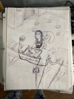
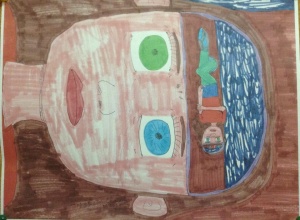
Art has been, and always will be, Chris's selling point. Chris has been involved with some form of art or another throughout his life. He has taken numerous art and design classes in high school, and he holds a degree in computer-aided drafting and design. But despite his extensive education in the visual arts (and relative lack of other discernible skills), his style is quite unique, to say the least.
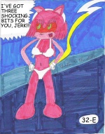
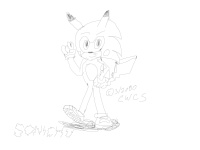
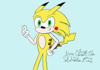
Ever since the very day Jason Kendrick Howell found out about Chris's creation of Sonichu, many people have taken interest in Chris because of his infamously bad artwork. Ironically, his crude creative abilities are what made him stand out as an artist. Sonichu wouldn't be Sonichu without Chris's art. Encouraging Chris to produce more of it remains a popular objective amongst trolls and weens.
Before we get started with today's critique...
It can be easy to simply write off Chris as a bad artist without asking why. But of course, visual art is subjective – there are a multitude of reasons why someone might not like a particular work, and there are bound to be people who will like it. Different styles suit different artists (and viewers), and realism isn't exactly the gold standard of good art. The fact that people commission Chris is proof that he isn't objectively a failed artist. After all, he sold more art than Van Gogh ever did in his lifetime.
Chris is no naive artist – he took art classes throughout his schooling. He is most likely familiar with the process of artistic critiques in an academic setting. This article will reflect that process.
Instead of outright praising or bashing Chris's art, this critique will offer constructive criticism. It will examine strong and weak points of Chris's art in an objective, taste-neutral manner. It will examine all media but place special emphasis on his most proficient medium: drawing. The article will also consider the context of Chris's art. Finally, it will consider ways he has improved his craft, aspects that can be improved, and techniques he is outright unwilling to improve.
Weak points
Exercise of skills and improvement in craft
Chris does not seem to consider his artistic skill in need of revision; he is always fully satisfied by the first attempt at a drawing he makes. Naturally, being an artist of that caliber, Chris takes it upon himself to criticize the art that his True and Loyal Fanbase send to him, and is quick to point out the myriad of "flaws" in each work.[2][3]
Chris has said he spends "an hour at most" drawing a comic page and about a half-hour coloring it.[4] He does not seem to be aware of the fact that producing the kind of high-quality artwork that fans expect in a good comic strip is very labor-intensive and can easily take hours, sometimes days, even with professional software programs like Photoshop. He also doesn't seem to understand, or care, that any good artist will draw a scene multiple times before they publish it, especially if there are mistakes. In pretty much any episode of Sonichu, you will be sure to find at least one mistake Chris has made that he refuses to redo and simply colors over. One good example is the scene from Chris and Ivy going to a hotel for hanky-panky.[5] If you look at the scene, you can see multiple mistakes that any artist would have seen as a reason to redo the picture. Chris started to draw his balls (via tracing), but decided he didn't like the proportions that presented, so he decided to keep the start of the trace and just add some "speed lines". If you look at the picture of Ivy you will see that Chris messed up a bit around her face but decided that instead of redoing it, he'd just color over it. He also messed up a bit on her right breast; he drew one too small and decided to make it bigger, by just adding another curved line.
At times, he would expand Sonichu stories in summary form on CWCipedia, a medium better equipped to keep up with his racing, easily distracted imagination. Everything he says or writes, he considers being a part of his comic's continuity partly because it is easier to record these euphoric and fleeting bouts of inspiration as they occur rather than days, weeks, months, or even years later in comic form.
Chris's art has improved in recent years: compare the original Sonichu 0 cover to his later covers. The amount in which he has improved, though, is up for debate.
Choices of materials and technology
Chris believes that his so-called "hand-drawn style" is superior to art produced by any other means. This is due to Chris's hatred to change what he has already learned and his belief, as a consequence of his ego, that his method is the best by virtue of being his.
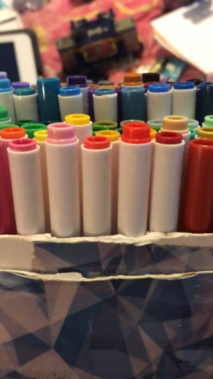
Obviously, Chris's skill cannot compensate for the poor materials he uses. He does his work a disservice by using tools that are the cheapest available: copy paper, Pentel RSVP ballpoint pens, and Crayola washable markers.[6] These happen to be the tools he has used since childhood.
Far from archival quality, his art has sometimes shown signs of wrinkling as soon as it has been finished. Chris has defended his practice of rampant textwalling as a way to "save marker ink."[7]
When Chris wants to alter a panel, but does not want to put in the effort to redraw the entire page, his method to fix it is to draw a piece on another page, cut it out, and glue it over the original drawing. This can be seen in revisions to Sonichu 15.
While Chris has claimed at various times to use Adobe Photoshop to create his characters and edit his comics,[8][9][10] he has only ever been seen using Adobe PhotoDeluxe,[11][12] with which he created his slanderous head-swap of Clyde's buddy Matt. This is in spite of the fact that PhotoDeluxe is intended for scanning and touching up photographs, and Photoshop (which Chris claims to own) would be better suited for the kind of general-purpose image editing and head-swapping that Chris does. In addition, PhotoDeluxe is a fossil of a program that hasn't been supported by Adobe since 2002. Chris's claim in Mailbag 3 that he uses "a past version" of Photoshop[13] could imply that he is confusing PhotoDeluxe for a part of the Photoshop line, or that, if he really does use Photoshop, the revision he owns is just as woefully out-of-date as his ancient PhotoDeluxe program.
Chris's font of choice for most of the Sonichu comics was Comic Sans, a font almost universally condemned for being overused, childish, unprofessional, and ugly; serious designers generally only use it as a last resort or for ironic effect, since better handwritten fonts are available for purchase.[14][15] However, starting from Sonichu #12-9 onward, he switched to Proxima Nova.
Drawing techniques
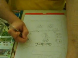
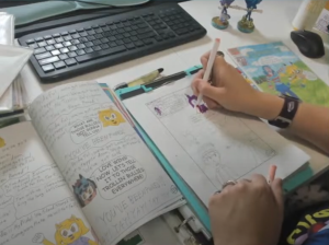
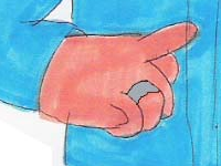
Chris has never even learned to hold a pen correctly. Instead of holding the front of the pen with the thumb and forefinger, he draws with his index finger sticking out and bent around the pen. Give this a try and see how long it takes for you to get carpal tunnel.
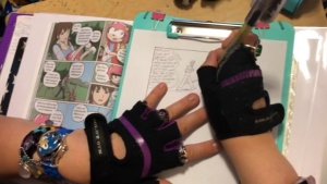
In CWC - Hand Drawn Original (2009), Live Drawing Streams (2017), and Over the shoulder colouring stream (2023), Chris demonstrated his drawing technique on video.
During 2019, Chris hampered his ability further by wearing his gym gloves while drawing.
| “ | I don’t want to deal with the constant pencil sharpening and all that trash. | ” |
| Chris giving one of his reasons for why he uses a pen for line art[16] | ||
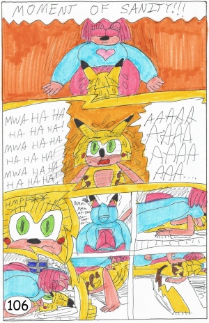
While most artists will produce multiple sketch versions of a single drawing, often layered on top of one another, Chris is so confident in his innate artistic ability that his first step in a page of Sonichu is drawing the final line art in pen before coloring it in with Crayola markers. If he makes a mistake, he shrugs it off and continues. There is no post-processing beyond adding text to word balloons with MS Paint and PhotoDeluxe. Attempts to inform him that digital coloring is more efficient and far less expensive than wasting gallons of marker ink filling in monocolor backgrounds have failed.
Visual style and most artistic fundamentals
| “ | sonichu had kind of a kiddy art style, which i guess was your point. [...] i thought you meant it as an avant-garde thing, to make a statment like, ironically bad |
” |
| Jackie[17] | ||
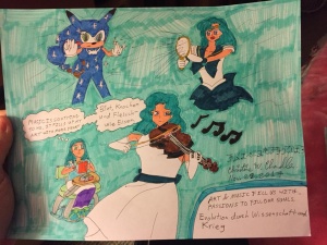
Before the comics, Chris attempted realism for work in oil pastel, charcoal, and graphite, presumably for art classes in school. The results can be seen in the gallery below. While he did spend some time in high school taking art classes, most professional artists heavily study artistic fundamentals before venturing off into the territory of stylization. Without knowing how things appear in reality, it is difficult to distort properties to an aesthetically pleasing effect. Chris trusts in his abilities yet lacks proficiency in the most important fundamentals. This overconfidence results in the Sonichu comics looking like they were drawn by a grade-schooler.
Chris started out with a cartoony style for the comic book, full of techniques consistent with early efforts at drawing by small children. Things changed as Chris got into anime and manga, and sought to emulate them to impress his gal-pal at the time, Megan Schroeder. Like many amateur western artists, he copies only the surface elements of the anime style: big eyes, pentagonal heads, speed lines, emotions. These elements were simply laid over his original "style" with no adjustment, and did nothing to improve the quality of his work.
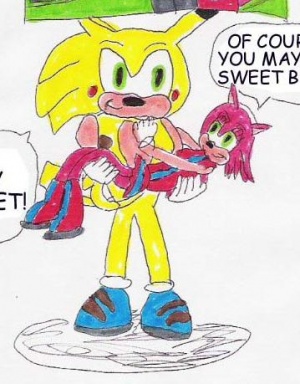
Chris has no understanding of classical anatomy, proportion in figure drawing, or even basic form. His characters are drawn using simple shapes – colored-in outlines, without any shading, ever – and even so, he is unable to keep the shapes consistent to any degree. These shapes rarely have any form at all, leading to characters having a "cardboard cutout" quality to them: head-on body with a slightly turned head. Though he lacks the skills to make even decent simple poses, Chris has the balls to attempt foreshortening on occasion- with disastrous results.
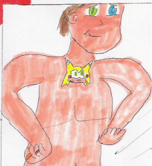
Characters have no set proportions: limbs morph, heads change size, and faces become unrecognizable; it's only by the color scheme that we can guess which character is which. For example, in the opening of Sonichu #11, the children tend to noticeably get deformed in a different manner in each panel, despite the fact that they're drawn as just an oval for the head, a rectangle for the body, and smaller ovals for the arms and legs. Just to be sure we know who's who (a job that is taken care of by the artwork in any normal comic) Chris sometimes relies on labelling characters with text and arrows. Beyond his differently-colored eyes and Sonichu medallion, no two Chrises have ever looked alike, or even remotely resembled the actual Chris. The character sizes are also inconsistent, which is strange considering most of the characters appear to be about the same size: in most drawings where Sonichu is carrying Rosechu, Rosechu seems to shrink.
Finer details of human anatomy have long escaped him; because Chris never draws women with pronounced hips, the results tend to resemble children or men (such as with the character Lovely Weather), with unfortunate implications in either case. Chris also doesn't seem to realize that drawing techniques that work in other media might not work in cartoons. For example, he sometimes draws himself with almond-shaped eyes. While no real person's eyelids are perfectly circular like a cartoon character, cartoonists generally reserve non-circular eyes for Asian characters.
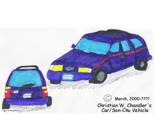
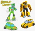
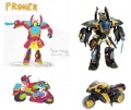
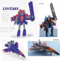
Despite boasting that his "drawings of perspective viewpoints are surpassive [sic]"[18] due to his training in CADD, Chris constantly fails at perspective, with objects implied to be far-away depicted too large. This is evident in his many vehicle designs, where the front is usually a direct frontal (90 degree) view, regardless of the view angle of other sides. This inability to demonstrate parallel lines renders the car distorted. The lack of any concept of shading only further destroys any semblance of perspective; legs that are implied to be bent forward at the knee only end up looking shorter.
Possibly the worst offender is Chris's constant omission of backgrounds. Most scenes happen only on the white backdrop of the paper. Readers are apparently supposed to infer what the background looks like based on context, similar to some daily newspaper comic strips. Thus, simply drawing a wide-angle shot of the scenery as the first (usually transitional) panel in a scene would suffice. Combined with his inability to make a proper layout, many action scenes end up becoming a jumble of characters moving around without regards to sequence. The reason he does this is probably the same as the reason why he textwalls so often: to "save marker ink," meaning he's lazy. (Incidentally, the proper use of white space and the conservation of painted space is a key element in East Asian art, but despite his anime obsession he is unlikely to have heard of this).
A related phenomenon is simply drawing characters as floating disembodied heads. The deus ex machina/exposition machine is the biggest victim of this. Once again, Chris couldn't bother to draw a full body. Thus, combining all known forms of "marker ink conservation", some pages are just a bunch of literal talking heads speaking walls of text.
Chris owns at least one book about drawing manga, as seen in My Half of A Whole New World for Kacey. The book in itself covers everything to do with portraying couples, including images of couples in bed making love. Whether Chris bought it to better draw out his delusional fantasies or for more material to mass debate to isn't known, but either way, the book taught him nothing.
Character design

|
PROTIP:
Keep in mind that Chris dislikes it when people redesign his characters.
|
See also: Written characterization
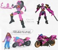
A large portion of the Sonichu cast is clearly derivative of existing characters. In addition to the obvious Sonic the Hedgehog recolors, Chris has lifted designs from any anime, video game, or even Western animation he is fond of, with no regard for visual consistency.
Beyond that, he doesn't even bother trying to design better clothing for his characters. Most of them wear stereotypical "basic" clothing, and Chris himself wears his usual clown shirts and pants. With the sole exception of Meg-chan, every female that shows up in his comics wears high-heeled dress shoes.
Even when the source of Chris's plagiarism is readily apparent, these lifts can still add up to less than the sum of their parts. Inspired by the fusion characters of Dragon Ball Z and God of War, Collosal Chan looks more like a hobo than a fusion of Chris and Chris-Chan Sonichu. Though clearly, his own effort to design baby Pokémon, Sonee and Rosey look more unnerving than adorable.
Fan (dis)service
| “ | I am not a gorey artist; just accept the Fan Service of panty-shots and get over yourselves. | ” |
| [19] | ||
Fan service is a term used to describe something that is meant to tease or please the audience. It can refer to any content seen as an effort to appease the desires of fans, but for the sake of this section, it's used primarily to describe scenes of a sexually titillating nature.
Since his discovery by the Internet, Chris has inserted increasingly large amounts of fan service into the initially tame Sonichu in an effort to assert the heterosexuality of himself and his characters. The range of fan service in Sonichu includes panty shots, Rosechu's stripping, cameltoe indentations, and even a full sex scene followed by four pages of text and diagrams describing Sonichu and Rosechu's sexual anatomy.
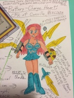
Due to his lack of artistic faculties, much of Chris's depictions of sexuality are highly unsettling to most readers. Any attempts to add "sexy" material come across as Chris's own wish-fulfillment or self-interest, rather than attempts by Chris to please his audience.
While the point of fan service is to hint at sexuality in an otherwise clean work meant for general audiences, Sonichu's sexual content hides nothing and disturbs many, despite the fact that Chris has always viewed Sonichu as a comic intended for children. Chris tried to justify putting panty shots in a children's comic by saying...
| “ | Children will likely be seeing the same things in real life, so mellow out and let them learn a bit, and further educate the children with discussions. | ” |
| Children will be seeing furry porn in real life.[20] | ||
Strong points
Chris is far from the worst artist ever; there are several strong points to his work that set him apart from other poor artists.
Color choices and coordination
Chris does get color coordination. Most of the color schemes he uses in his work look decent. Being Chris, he still fails occasionally, such as with the CWCipedia color scheme. Still, color is one of his few strong points, at least compared to the rest of his art style. As evidenced by most of his websites, custom console skins, and a good chunk of his character designs, Chris's favorite colors appear to be yellow and blue. That color combination is hard to get wrong, which is why so many cartoon characters (from the Simpsons to SpongeBob) have yellow skin. Chris also appears to be fond of the red, white, and blue compliment, judging by his trademark polo shirt.
Despite excelling in this fundamental field, Chris does struggle with coloring rainbows in the correct order of ROYGBIV.
Dexterity
Despite his awkward pen grip, Chris seems to have a mostly steady hand. His penmanship is neat and legible, and most of his mistakes stem from writing the wrong letter and scribbling/doctoring it into the right one, instead of any kind of actual handwriting disorder. His most recent driver's license signature appears to be quite flourished and feminine. Many artists with unorthodox hand techniques claim their grips can actually give them more control over the pen, and even trained calligraphers don't always stick to the standard grip that most are taught in kindergarten.
Chris never seemed to struggle in the dexterity department – he can write and draw more neatly than folks with poor fine motor skills. He doesn't have an issue with other activities requiring dexterity, such as typing or playing video games. The autism papers don't even mention poor fine motor coordination, which is relatively common (but not universal) among autistics. Even our own article on Chris's diagnosis doesn't touch his dexterity, only his gross motor skills. For once, Chris's autism isn't the culprit!
If Chris actually took his time and learned patience, his line work could be phenomenal.
Reach
See also: Warhol / Chris Chan
Chris has undoubtedly become a pop culture phenomenon, while many other artists who spent decades refining their craft can go their entire lives without selling many paintings – or any at all. Looking at medallions alone, Chris has sold more works than Frida Kahlo even produced in her lifetime. Chris's works have been referenced in master theses, published essays, and other academic media countless times. Judging by artists like Van Gogh or Warhol, GodBear knows if Chris's works will end up in a museum some time after his passing. The fact that people are compelled to look at Chris's work at all speaks volumes.
Is art even Sonichu's main failing?
- Main article: Chris and writing
Complex drawing is not mandatory for making a good comic. Chris's art style is arguably more complex than the style Charles Schulz used for Peanuts. Diary of a Wimpy Kid and xkcd get the job done with simple stick figures. Some artistically challenged cartoonists will even ditch the pen for a nice camera to create a photo comic. These genres might not carry museum-quality art, but the cartoonists generally make up for it with clever writing.
However, Sonichu doesn't even have that to fall back on. Chris does no preparatory writing or preliminary revision; his narrative is wholly improvised and shifts regularly. He cannot write clear, succinct dialogue, and he has little regard for visual clarity.
He doesn't understand how graphic novels are supposed to work as a narrative through sequential images, and instead presents the series more like a storyboard for a hypothetical television series. As a whole, the series has excessive dialogue, something better suited for a novel or television script. It often uses literal phrases (e.g., "cuts grass") as a substitute for visual action and/or comic onomatopoeia. Chris divides each volume of Sonichu into "episodes", a concept popular in TV land, but unheard of in the comic book industry. Perhaps Chris isn't interested in art or comics – he's just interested in Sonichu.
Other peculiarities
"Me" arrow
In some artwork from the latter 2010s, Chris put a small "Me" sign, often with an arrow, next to the character (or characters) meant to represent him. It is unclear why Chris does this, although the usage correlates with him exploring the concept of alternate realities as a coping mechanism.
Chris and digital art
Much like his opinions on alcohol, LGBT+ folks, butt play, and the holy HEXBox, Chris's thoughts on digital art have evolved from outright bashing to a much more open outlook.
During the classic era
In the early 2000s, Chris was somewhat open to the digital arts. He created Sonichu in a high school computer graphics class, and he would brag and boast about his CADD major. Things changed soon after.
Chris would often state that using new technology creatively provides an unfair advantage in the service of inferior results. Repeatedly, he has called Asperchu "blocky and low resolution" because it was drawn with a tablet, this is most likely because Chris thinks that doing digital art instead of the traditional way makes results comparable to poor MS Paint drawings that are more familiar with him. In one of his phone calls to Alec Benson Leary, Chris said his hand-drawn art had "more character" (never mind that tablet art is technically hand-drawn art anyway).
A change of heart: Chris gets an iPad
Chris began opening up to digital media in the 2010s. In May 2020, during his phase of role-playing as Sonichu, Chris used his COVID-19 Economic Impact Payment check on an iPad, software, and accessories for drawing digital art. He successfully made a drawing of Sonichu, though was annoyed by the interface during the process.[21]
On 14 July 2021, Chris tagged the Crayola company in a Twitter thread, complaining about inconsistencies between similar- and same-colored markers.
A Twitter user then asked Chris if he would switch to digital art, stating "it might be better for you in the long run". Instead of defending his marker-on-paper style like usual, he responded favorably:
| “ | Eventually, likely so. I have been so very busy to totally find my niche with a tablet and stylus pen setup. Sonichu gave my body a conscious start on the setup with the iPad, but that’s a major Gonna need more free time to practice with it. I haven’t found the right timing yet | ” |
| Chris[22] | ||
Notably, Chris admitted that digital art takes effort, and he seems willing to make the switch in the future after some practice.
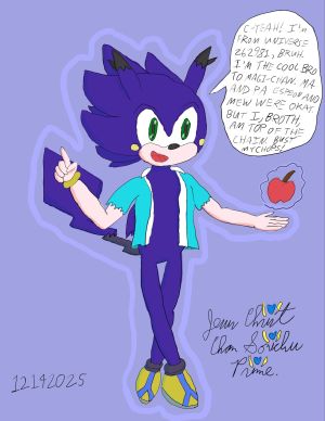
In December 2025, Chris began offering digitally-drawn commissions for sale (alongside physical drawings).[23]
AI Art
- Main article: Chris and Artificial Intelligence
Chris's other artistic media
Drawing may be Chris's medium of choice, but he's dabbled in others.
3D Media
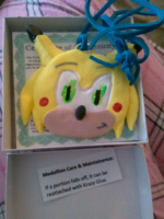
Chris has produced a line of Sonichu medallions, made out of Crayola fuckin' Model Magic and acrylic paint. In September 2014, Chris started selling replicas of his handcrafted medals, produced to various qualities.
He has made Sonichu Amiibo by Frankensteining multiple Amiibos together and crudely painting them.
Another 3D piece is his Sonic Totem from middle school, which sold on eBay for $1500 USD.
3D printing
- Main article: 3D printing
Chris has long held an interest in using 3D-printing technology, although the most he has done with it is plagiarize files for printing, then hand-paint them.
Photography and Videography
- Main article: Chris and cinematography
Video media has been some of Chris's most frequently produced content. The lacking production quality is frequently compensated for by Chris's emotional theatrics.
Animation
Chris at one point tried taking up a new medium in the form of animation. Using the Nintendo DSi program Flipnote Studio, Chris took his drawing to a whole new level...or least, he could have. His drawing degraded greatly when doing artwork here, mostly due to using the DS's stylus pen. When doing animations, his characters have very little fluid movement to them and they seem to jerk and wobble, as if they're characters from Ed, Edd n Eddy or Home Movies. The best one to tell of this is the Don'tGetTrolled! animation; you can tell which part was animated by Chris and which part was animated by the original author, 8-Bit, because Chris's artwork just wobbles in a distorted fashion.
Music
- Main article: Chris and music
Chris is a passionate musician who has self-released three albums, all of which feature him tone-deafly singing derivatives songs on top of famous music.
Sewing
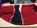
Chris "restored" his classic striped shirt himself before attempting to sell it. As said shirt spent three years in a water-filled trash bag and was damaged beyond repairability, it didn't work out that well.
Spray-painting
- Main article: Shoe Colouring
On 3 August 2018, Chris tackled shoe customization and spent an hour spray-painting a pair of Adidas in Sonichu colors.
Costume Design
- Main article: Chris and cosplaying
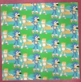
Continuing his trend of using the cheapest materials possible while incorporating only the vaguest of likenesses, Chris's foray in cosplay is par for the course with his hand-drawings. They're poorly made, not thought out, and Chris likely believes they're professional quality.
Originality and plagiarism
- Main article: Things Chris has ripped off
When it comes to originality, Chris has absolutely none.
Sonichu is a fine blend of Chris's personal life and a wide variety of recognizable copyrighted elements. Just about any existing medium that Chris has ever expressed a fondness for appears in some capacity.
Chris has a long history of claiming all credit for fan characters initially acknowledged as being created by others and offered for use in Chris's comics. The first of these were Megagi, Jiggliami, and Layla, but the most infamous instance, and the one that Chris defended the most fervently, was Simonla Rosechu.
At the same time, Chris once had a policy of threatening nonexistent legal action against the creators of any Sonichu fan art he could find, and was worked into a magnificent rage over the Sonichu-derivative fan parody Asperchu.
As well, Chris has gone so far as to take a video, the aforementioned Don'tGetTrolled!, and alter it to suit his needs. Now, granted, there were other videos done using that same video, but where they just altered the stick character or sped up the video in the same vein as a YouTube Poop, Chris completely and utterly altered the video to suit his needs so that a humorous song about trolling is turned into Chris's mouthpiece to destroy Freedom of Speech to make the Internet safer for him.
Art gallery
School art
Seen below is a selection of Chris's public school art assignments, from a slideshow on Chris's homemade DVD. At his high school graduation, Chris expected to be "Highly Recognized" for his "ARTISTIC TALENT", represented in this body of work. When he was not, he cried.[24] This work was produced under the supervision of a professional art instructor and the incentive for Chris to give each piece more thought, care and attention than he now prefers to when creating only for his own satisfaction. Despite this, they're still terrible. Note that some readers may find several of these images inadvertently terrifying.
| Gallery |
|---|
|
Tracing
Tracing is an art technique where another piece of art, in whole or part, is copied along with its outlines. As a means of producing original art claimed as one's own, tracing is a form of plagiarism.
Images traced from existing copyrighted content appear regularly in Sonichu. Chris traces with the Reflecta Sketch, a long-discontinued toy tracing kit produced by Spin Master. The kit comes with a reflective piece of plastic where an original can be placed to the left and the reflection is used for tracing an outline. This is why most traced images in Sonichu are mirror images of the original work. Due to their poor quality, consistent in appearance with Sonichu art that is not traced, these traced images often go unnoticed as tracing. The fact that Chris fails even at tracing is a surprise to no one.
Alternatively, Chris uses these images as references and simply tries to draw images free-hand based on them. This is no worse than directly tracing the outlines, but better explains why his results are so distorted in respect to their references. Chris probably uses a combination of both techniques (as some images look closer to their originals than others), showing an utter lack of skill and originality either way.
The coveted art award at his high school graduation would have lost a crap ton of prestige had it been awarded to a cheater like Chris.
| Traced images from the Sonichu Comic |
|---|
Rule 34

|
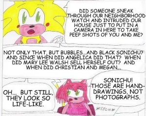
Chris has no shame, and neither does his artwork. Of his many sexually explicit drawings, the most damning one of all is ShecameforCWC.JPG, which brought an end to the Megan Saga and cemented the notion that Chris was an incestuous pedofork.
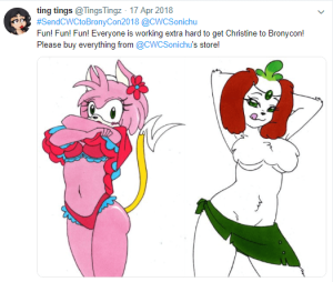
As seen in this gallery, Chris can't even copy bad porn to save his life, with Rosechu turning into a deformed monstrosity in each panel, all for the sake of sex. Especially noticeable is the final picture, which shows off a recurring trend in his pictures: the "Glowing Cunt", in which Chris draws the "cum" from the woman around and outside the vagina instead of from the inside, making it appear to glow, or inhabit heavenly clouds.
It can be reasonably assumed that all of the images in this gallery are traced, and that those not paired plagiarized source material simply have yet to have their "inspirations" discovered.
| Gallery of traced Rule 34 pictures. Incredibly horrific, NSFW, and contains robo-clits. This is your last chance to escape with your sanity. |
|---|
Tomgirl art
Drawings Chris made since 2011. Some are NSFW.
| Gallery |
|---|
|
| Art for Catherine, 2014 |
|---|
Paid art
Drawings from Chris's eBay and Etsy sales.
- Main article: Original Sonichu and Rosechu Drawing
- Main article: Commissions
Sources
- ↑ January 2020 social media posts
- ↑ Ivy Q&A#After Emily
- ↑ CWC Personal Sonichu Presentation#Part 2
- ↑ Mailbag 2#In which Chris insults someone who drew a picture for him
- ↑ File:SchuComicSP3P5.jpg
- ↑ Mumble #7
- ↑ Mailbag 19
- ↑ Sonichu's Conception and Creation, archived from CWCipedia.
- ↑ Miyamoto emails#Please Give Me $800
- ↑ Chris's resume#Experience
- ↑ The Adobe PhotoDeluxe name can be seen on the taskbar of Chris's computer at 0:13 in Clyde's Buddy Matt Getting SUPER-LAID!!!.
- ↑ Chris offered PhotoDeluxe advice to The Wallflower in Wallflower E-mails 2.
- ↑ Mailbag 3#Art questions
- ↑ Ban the Comic Sans
- ↑ They will make you taste the curb
- ↑ https://web.archive.org/web/20191108234140/https://twitter.com/cwcsonichu/status/1001562775209086976
- ↑ Jackie Chat 2
- ↑ Miyamoto Saga
- ↑ Mailbag 45#Chris' hormones + Rosechu's ass = Fan service
- ↑ Mailbag_47#Children_will_be_seeing_furry_porn_in_real_life
- ↑ May 2020 social media posts#Chris gets an iPad
- ↑ July 2021 social media posts#Digital art
- ↑ December 2025 social media posts#Announcing digital commissions
- ↑ Manchester High School#Graduation
- ↑ IRC (18 December 2008)
| Chris and... |
|
Body: Drugs • Fashion • Gender • Health • Nutrition • Sex Psyche: Coping • Manipulation • Mental healthcare • Nostalgia • Reality Personality: Anger • Ego • Hypocrisy • Introspection • Kindness • Negligence • Personality • Remorse • Stress Expression: Art • Censorship • English • Language • Music • Oratory • Spanish • Writing Society: Animals • Contests • Death • The Law • Politics • Pornography • Race • Reading • Religion • Sexuality • Socialization • Sports Business: Brand loyalty • Business • Copyright • Money • Negotiation • Work Technology: AI • Cameras • Electronics • The Internet • Science • Television • Video Games |
